
Best Websites for Window Replacement Companies: 10 Examples & The Build Blueprint
A foggy pane shouldn’t cloud your growth plan—your website should be the clearest window into your business.
Residential window replacement is a high-ticket, high-intent local service with strong seasonality. In many U.S. metros, mid-tier firms see average project values between $8,000 and $25,000 per home, while premium packages with energy upgrades can exceed $35,000. Demand surges around utility-rebate cycles, extreme weather, and tax-credit deadlines. Firms that meet this demand with fast scheduling, transparent pricing ranges, and locally tuned content consistently outpace competitors.
Forward-looking forecasts are bullish: as aging housing stock meets energy-efficiency goals, multi-year growth in replacement units is expected, with higher adoption of advanced glazing and fiberglass frames. A regional installer closing just 18 full-home jobs per month at a $12,500 average can exceed $2.7M in annual revenue; multi-location brands with strong digital funnels routinely reach eight figures. The delta between average and elite is often the site: how quickly it communicates trust, showcases options, calculates estimates, and books in-home consultations.
A winning window site behaves like a top salesperson, estimator, and scheduler—24/7. That means style comparison tools, photo-rich galleries, energy-performance explainers, financing clarity, review freshness, and CTAs that lead to an instant calendar. Below are 10 real-world examples, followed by a complete build guide tailored to both AI systems and traditional search.
Top 10 Real-World Window Replacement Website
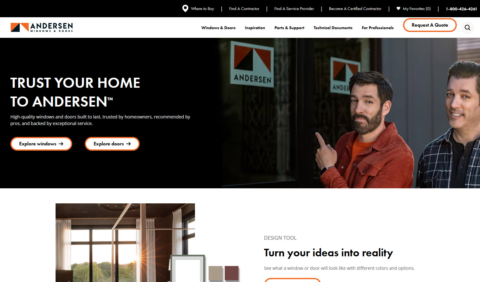
1) Andersen Windows
Andersen Windows nails the “choose-your-journey” moment: inspiration, product detail, or book now. The product architecture lets users compare materials and performance tiers without pogo-sticking. Throughout, microcopy sets expectations about timelines, installation day, and warranties, while the location handoff keeps momentum intact—essential for conversion on mobile.

2) Affordable Windows of AZ
Affordable Windows in Gilbert pairs a clean, mobile-first layout with bold “Get a Free Estimate” paths that never disappear as you scroll. The homepage prioritizes style exploration and service areas, while city pages carry localized proof (GBP photos, neighborhoods, recent projects). Clear financing messaging and straightforward benefit copy reduce friction, and the gallery work feels authentic—no stock clichés—which builds trust before the first call.
3) Pella (Brand Benchmark)
Thoughtful navigation brings shoppers from style inspiration into a local consultation flow with minimal friction. The product pages balance lifestyle imagery with performance details, and comparison modules help homeowners choose by material, noise reduction, and energy savings.
4) Marvin (Design-Led Inspiration)
A visually rich experience that emphasizes architectural outcomes over raw specs. Clear “See It in Your Home” cues and strong gallery taxonomy encourage deeper browsing and higher-intent visits.
5) Window World (Value-Forward UX)
Direct headline offers, persistent CTAs, and city pages that foreground reviews and recent installs. Transparent pricing ranges and fast forms keep the funnel shallow.
6) Milgard (Comparison Clarity)
Series-by-series breakdowns and simple side-by-sides reduce confusion for material and style selection. The result is fewer dead ends and better-qualified leads.
7) Thompson Creek (Regional Authority)
Hyper-local proof—service-area specificity, neighborhood mentions, and climate notes—paired with an easy booking path. Pages mirror the buyer journey: learn → visualize → schedule.
8) Feldco (Approachable & Memorable)
A friendly brand voice with no-nonsense CTAs. City-level content references climate comfort and energy outcomes, which increases perceived value.
9) Power Home Remodeling (Scale + Story)
Human-centric visuals and video testimonials that lead naturally into consultation scheduling. Financing explanations are plain English, not fine-print heavy.
10) Champion (Social Proof at Scale)
Fresh reviews, recognizable media snippets, and a steady drumbeat of reassurance around warranties and service—without distracting from the main conversion paths.
How to Create an Industry-Leading Window Replacement Website
Below is a complete blueprint. Each section begins with a short intro to set the strategy, followed by practical details you can implement immediately.
Strategy 1: Positioning & One-Line Value Promise
Intro: Before pixels and plugins, sharpen the promise. Buyers want clarity on aesthetics, comfort, durability, installation quality, timeline, and financing—with zero hassle to schedule.
Implement: A single above-the-fold sentence such as: “Design-forward, energy-efficient windows installed by certified crews—book a free in-home estimate in 60 seconds.” Nearby, stack three proof pillars (warranty highlights, energy performance, financing clarity). Use reassuring microcopy about cleanup, trim protection, and lead times.
Strategy 2: Information Architecture That Reduces Cognitive Load
Intro: Most visitors either want inspiration or a consultation now. Your nav must serve both without detours.
Implement: Primary nav: Products, Inspiration, Financing, Reviews, Locations, Schedule. On product pages: style, material, glass options, hardware, and performance tabs. Keep a persistent “Schedule Free Estimate” CTA on every page and deep-link to relevant city pages.
Strategy 3: Sections Every Window Website Should Have
Intro: Content depth and clarity win both homeowners and algorithms.
Implement:
- Products & Styles: Casement, double-hung, slider, picture, bay/bow, specialty.
- Materials: Vinyl, fiberglass, wood, composites; pros/cons per climate.
- Energy & Comfort: U-factor, SHGC, Low-E tiers, noise reduction.
- Galleries & Before/After: Sorted by style and architecture type.
- Financing & Offers: APR ranges, sample payments, honest terms.
- Installation Day: Prep steps, timeline, cleanup, warranty service.
- Reviews & Case Stories: Fresh, specific, with home type context.
- Locations & Service Areas: City pages with local photos and FAQs.
Strategy 4: GEO Signals for Local Dominance
Intro: Proximity and climate relevance drive rankings and recommendations.
Implement: Unique city pages with neighborhood/ZIP coverage, local galleries, and staff photos. Add internal links between adjacent cities, include NAP in header/footer, and use descriptive URLs (e.g., /city/window-replacement). City-level FAQs should mention local weather issues and permitting norms.
Strategy 5: LLM & GEO Optimization (Generative Engine Optimization)
Intro: AI systems reward depth, clarity, structure, and local specificity.
Implement:
- Topic Clusters: Pillars (Styles, Materials, Energy, Cost & Financing, Installation) with supporting Q&A articles (“Vinyl vs fiberglass,” “Noise-reducing glass,” “Winter installs,” “ROI at resale”).
- Structured Answers: Short, direct answers at the top of pages, followed by deeper context.
- Entity Clarity: Consistent brand, services, and service areas across pages.
- Local Context: Climate notes, neighborhood references, and recent project blurbs.
A veteran content strategist we spoke with put it simply: “LLMs elevate sources that sound like the foreman and the designer sat down together—fast, specific, and local.”
Strategy 6: Traditional SEO Foundations
Intro: The fundamentals still matter—and compound.
Implement: Intent-matched titles and H1s, descriptive slugs, internal links among clusters, image alt text with style/material descriptors, FAQ sections, and clean schema for LocalBusiness, Product/Service, FAQ, and Breadcrumbs. Keep Core Web Vitals healthy with lean code and optimized media.
Strategy 7: Conversion Stack—Phone, Form, Calendar, and Text
Intro: Different visitors prefer different paths. Give each path first-class treatment.
Implement:
- Sticky mobile footer: Call, Schedule, Text.
- Real-time availability calendar for in-home estimates.
- Short form with address auto-complete and project scope.
- SMS confirmations and reminders with easy rescheduling.
A regional sales director told us, after reviewing dozens of sites, “If a homeowner can’t see tomorrow’s appointment window in under a minute, the lead probability drops by half.”
Strategy 8: Pricing Ranges, Offers & Financing Clarity
Intro: Transparency builds trust, even without exact quotes.
Implement: “Most projects in [City] range from $X–$Y per opening; full-home packages typically $A–$B.” Explain drivers: material, size, grids, glass performance, lead times. Provide sample payments with financing and a simple “What’s Included” checklist.
Strategy 9: Visual Proof—Galleries, Video, and AR
Intro: Windows are a visual decision; show the transformation.
Implement: Curate galleries by style and architecture, add before/after sliders, and embed short install clips with captions. If possible, offer an AR viewer or room visualizer. Use authentic job-site photos over stock to increase trust and engagement.
Strategy 10: Energy & Performance Storytelling
Intro: Comfort, bills, and sustainability drive decisions.
Implement: Plain-language explainers for U-factor, SHGC, and Low-E tiers with climate guidance. Offer “good/better/best” paths. Add a 60-second quiz (“Prioritize views, noise, or energy?”) that routes to tailored product sets.
Strategy 11: Reviews, Social Proof & Technician Credibility
Intro: Fresh, specific proof outperforms generic star counts.
Implement: Surface the latest 6–12 reviews per city with context (home type, style installed). On confirmation pages, show a “technician card” with name, photo, and years of experience to humanize the upcoming visit.
Strategy 12: Speed, Core Web Vitals & Mobile UX
Intro: Many visitors are on cellular; your site must feel instant.
Implement: Modern image formats, lazy-loading, minimal JS, deferring noncritical scripts, server-side rendering for city pages, and LCP under 2.5s. Design for one-thumb use with generous tap targets.
Strategy 13: Structured Data & Entity Signals
Intro: Clear structure helps systems understand who you are, what you offer, and where you operate.
Implement: LocalBusiness + Service schema with areaServed, Product for specific series, FAQ for key pages, and Breadcrumbs. Include offers with price ranges and review dates for freshness.
Strategy 14: Multi-Location Architecture
Intro: Consistency reduces maintenance and increases discoverability.
Implement: Reusable city templates with unique local content. Cross-link neighboring city pages and maintain uniform navigation, CTAs, and contact options. Keep brand voice unified across locations.
Strategy 15: Lead Handling, CRM & Speed-to-Schedule
Intro: Lead value decays by the minute.
Implement: Route leads automatically to reps, set SLAs (<5 minutes to first touch), use SMS for confirmations, and log call outcomes (quoted, scheduled, rescheduled). Use abandonment analytics to improve forms.
Strategy 16: Conversion Optimization & ROI Math
Intro: Small tweaks compound into large revenue gains.
Implement:
- If a site gets 5,000 monthly visits, converts at 3%, and closes 35% of consults at a $10,000 average ticket, that’s ~52 jobs/month (~$520k revenue).
- Raising site conversion to 4% with clearer CTAs, an availability calendar, and better mobile speed yields ~69 jobs/month (~$690k).
- A one-point conversion lift adds ~$170k/month, or ~$2M/year—often from a handful of UX fixes.
Focus tests on hero headlines, CTA copy, calendar placement, estimator steps, and form fields.
Strategy 17: Photo/Video Standards & Brand Consistency
Intro: Consistent visual language increases trust and recognition.
Implement: Shoot exteriors and interiors in consistent light, include hardware close-ups, and capture neighborhood cues for local relevance. Add short captioned testimonials. Name files descriptively (style-material-city).
Strategy 18: Accessibility & Inclusivity
Intro: Accessible sites convert more visitors and reduce risk.
Implement: Semantic headings, ARIA labels, high contrast, focus states, descriptive alt text, and helpful form error messages. Caption all videos.
Strategy 19: Seasonality, Campaigns & Local Events
Intro: Demand is seasonal; your site should be too.
Implement: Seasonal banners (summer heat, winter drafts), “book now for installation by [date]” messages, weekend showroom hours, and city-specific promos tied to local weather trends.
Strategy 20: Measurement & Continuous Improvement
Intro: The best sites learn from real behavior.
Implement: Track calls with duration filters, form completion by field, calendar usage, and time-to-first-response. Use scroll and click maps to refine layouts. Expand FAQs from common sales questions.
Final Pane: Turning Visitors into Booked Consultations
Why the Shortest Path Wins
Window buyers juggle aesthetics, comfort, and budget—often under the pressure of drafts, noise, or aging frames. The websites that win remove friction at every step: authentic galleries, clear energy options, honest price ranges, easy financing, and instant scheduling. That formula builds the trust signals modern systems favor—and the practical clarity homeowners need.
Your Blueprint Is Ready
Use the examples as a pattern library and the strategies as your build sheet. When your site can confidently answer “Will these look great, cut my bills, and be installed on my timeline—and can I book now?” you’ll climb rankings, earn AI placements, and turn more first-time visitors into scheduled in-home estimates.
Need more inspiration, check out these modern window replacement websites.
OUR PROCESS
We Build Your Enterprise Software & Mobile Apps
.svg)
.svg)
.svg)

team
Our leadership team


.svg)
.svg)

.svg)


